Show code
rm(list=ls())

df <- read.csv('https://www.dropbox.com/scl/fi/2zbxksqqv2igj3vq3hnh3/step_counts.csv?rlkey=t22p8s0wuzqbolewc0yph1m17&dl=1')In time series analysis, ‘models’ are mathematical representations that describe the underlying structure and behavior of time-dependent data.
As we’ve learned, they aim to capture and explain the inherent patterns within the data (trend, seasonality, and cyclical variations), enabling us to perform forecasting and explore causal influence.
Common models include ARIMA (AutoRegressive Integrated Moving Average), SARIMA (Seasonal ARIMA), and more advanced machine learning approaches like LSTM (Long Short-Term Memory) networks.
Our choice of model is important and depends on the specific characteristics of the data, such as its stationarity, seasonality, and noise. In this section we’ll review proper model selection, fitting, and validation.
First, we’ll create a dataframe called df from the stepcount data at the following link:
rm(list=ls())
df <- read.csv('https://www.dropbox.com/scl/fi/2zbxksqqv2igj3vq3hnh3/step_counts.csv?rlkey=t22p8s0wuzqbolewc0yph1m17&dl=1')Now, we’ll convert that to a time series object. The stepcount data has been collected daily, so I’ll use the xts package.
As the dataset doesn’t include dates, I’ll need to add those as well (xts requires this information).
# Load library
library(xts)
Loading required package: zoo
Attaching package: 'zoo'The following objects are masked from 'package:base':
as.Date, as.Date.numeric# Create a sequence of 730 dates starting from January 1st, 2020
start_date <- as.Date("2020-01-01")
dates <- seq(from = start_date, by = "day", length.out = 730)
# Convert to an `xts` time-series object
df_xts <- xts(df, order.by = dates)
# Plot the time series
plot(df_xts, main = "Daily Step Counts", xlab = "Date", ylab = "Steps")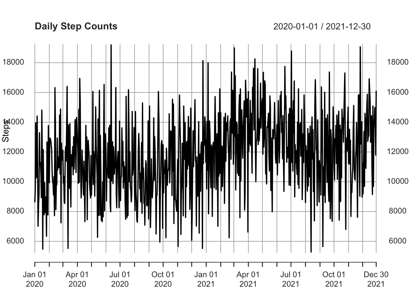
I’m going to decompose that time series, which is always good practice before doing anything more complicated.
ts_data <- ts(df_xts, frequency = 365) # convert to ts format

# Classical Decomposition
decomposed <- decompose(ts_data)
plot(decomposed)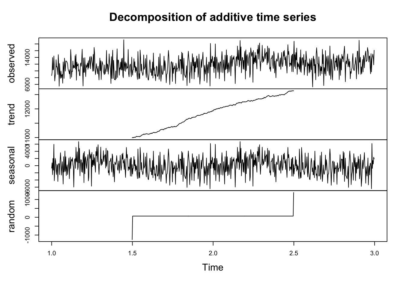
Now I’m going to build some predictive models.
# Load necessary libraries

library(xts)
library(forecast)
Registered S3 method overwritten by 'quantmod':
method from
as.zoo.data.frame zoo First, I’ll build an Autoregressive model. Remember (from this week’s reading) that these models predict future values based on past values of the same variable. An AR model uses the dependence between an observation and a number of lagged observations.
AR models rely solely on their own previous values for forecasts. For example, we might predict an athlete’s performance tomorrow based on their performance over the last few days.
In the following code snippet, I create an AR model. The important part is that I enter
max.q=0, which sets the moving average to 0. This means there is no moving average component in the model and hence it is an AR model.
# Fit an AR model
ar_model <- auto.arima(df_xts, max.p = 5, max.q = 0, seasonal = FALSE)
summary(ar_model)
Series: df_xts
ARIMA(5,1,0)
Coefficients:
ar1 ar2 ar3 ar4 ar5
-0.8477 -0.7124 -0.5096 -0.3345 -0.1593
s.e. 0.0366 0.0467 0.0501 0.0466 0.0366
sigma^2 = 7091095: log likelihood = -6782.18
AIC=13576.36 AICc=13576.48 BIC=13603.91
Training set error measures:
ME RMSE MAE MPE MAPE MASE ACF1
Training set 22.85655 2651.945 2128.143 -4.784338 19.67236 0.765478 -0.02843993Now I’ll plot that model:
library(ggplot2)

# Plot stepcount data
p <- ggplot(data = as.data.frame(df_xts), aes(x = index(df_xts), y = coredata(df_xts))) +
  geom_line(aes(y = coredata(df_xts)), color = "blue") +
  labs(title = "AR Model Visualisation", x = "Time", y = "Count")

# Add the fitted values
fitted_values <- fitted(ar_model)
p <- p + geom_line(aes(y = fitted_values), color = "red")

# Display the plot
print(p)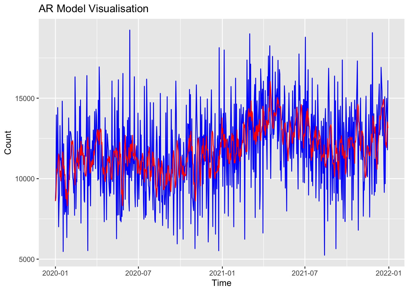
A second option is an MA model. Here, the moving average (q) is set to 5, and the autoregressive component is set to 0. This means the model is only using the moving average.
# Fit an MA model
ma_model <- auto.arima(df_xts, max.p = 0, max.q = 5, seasonal = FALSE)
summary(ma_model)
Series: df_xts
ARIMA(0,1,1)
Coefficients:
ma1
-0.9622
s.e. 0.0089
sigma^2 = 6146893: log likelihood = -6732.87
AIC=13469.75 AICc=13469.76 BIC=13478.93
Training set error measures:
ME RMSE MAE MPE MAPE MASE ACF1
Training set 94.73032 2475.894 1987.373 -4.0905 18.3443 0.7148437 -0.03965665I can plot that MA model to see how it performs relative to the ‘real’ data:
# Plot stepcount data
p <- ggplot(data = as.data.frame(df_xts), aes(x = index(df_xts), y = coredata(df_xts))) +
  geom_line(aes(y = coredata(df_xts)), color = "blue") +
  labs(title = "MA Model Visualisation", x = "Time", y = "Count")

# Add the fitted values
fitted_values <- fitted(ma_model)
p <- p + geom_line(aes(y = fitted_values), color = "red")

# Display plot
print(p)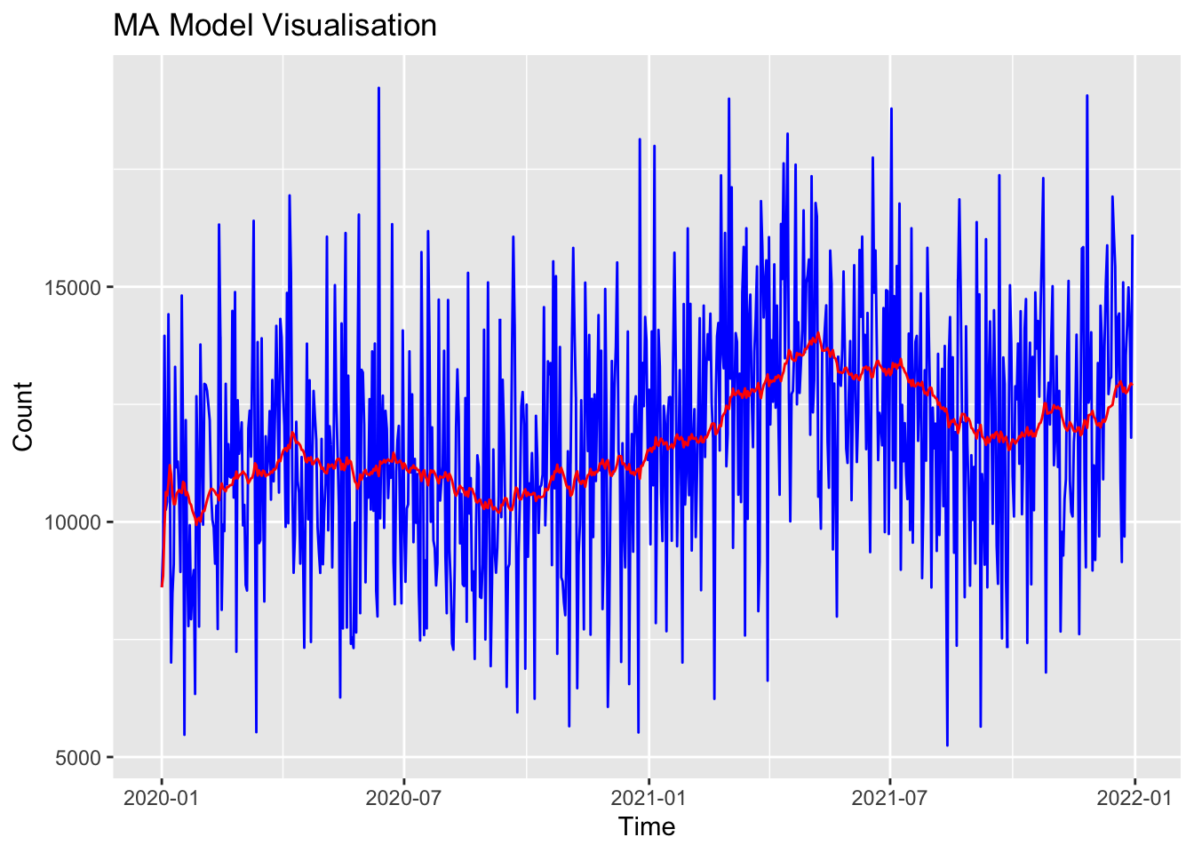
The ARIMA model is an extension of ARMA models that also include differencing of observations to make a non-stationary time series stationary. This process allows them to handle data with trends over time.
# Fit an ARIMA model
arima_model <- auto.arima(df_xts)
summary(arima_model)
Series: df_xts
ARIMA(1,1,2)
Coefficients:
ar1 ma1 ma2
0.7178 -1.7377 0.750
s.e. 0.1520 0.1397 0.134
sigma^2 = 6123110: log likelihood = -6730.51
AIC=13469.01 AICc=13469.07 BIC=13487.38
Training set error measures:
ME RMSE MAE MPE MAPE MASE ACF1
Training set 88.19725 2467.703 1981.442 -4.107803 18.28573 0.7127106 0.01238791I can plot that ARIMA model to see how it performs relative to the ‘real’ data:
# Plot stepcount data
p <- ggplot(data = as.data.frame(df_xts), aes(x = index(df_xts), y = coredata(df_xts))) +
  geom_line(aes(y = coredata(df_xts)), color = "blue") +
  labs(title = "ARIMA Model Visualisation", x = "Time", y = "Count")

# Add the fitted values
fitted_values <- fitted(arima_model)
p <- p + geom_line(aes(y = fitted_values), color = "red")

# Display plot
print(p)
Finally, I’ll calculate an Exponential Smoothing model. These models apply smoothing factors to make forecasts. They’re useful because they easily adjust to data trends and seasonal patterns by applying more weight to more recent observations.
# Fit an Exponential Smoothing State Space Model (ETS)
ets_model <- ets(df_xts)
summary(ets_model)
ETS(A,N,N)
Call:
ets(y = df_xts)
Smoothing parameters:
alpha = 0.0368
Initial states:
l = 10664.555
sigma: 2479.27
AIC AICc BIC
16227.87 16227.90 16241.65
Training set error measures:
ME RMSE MAE MPE MAPE MASE ACF1
Training set 87.19509 2475.872 1991.321 -4.172944 18.39359 0.716264 -0.03956356# Plot stepcount data
p <- ggplot(data = as.data.frame(df_xts), aes(x = index(df_xts), y = coredata(df_xts))) +
geom_line(aes(y = coredata(df_xts)), color = "blue") +
labs(title = "ETS Model Visualisation", x = "Time", y = "Count")
# Add the fitted values
fitted_values <- fitted(ets_model)
p <- p + geom_line(aes(y = fitted_values), color = "red")
# Display plot
print(p)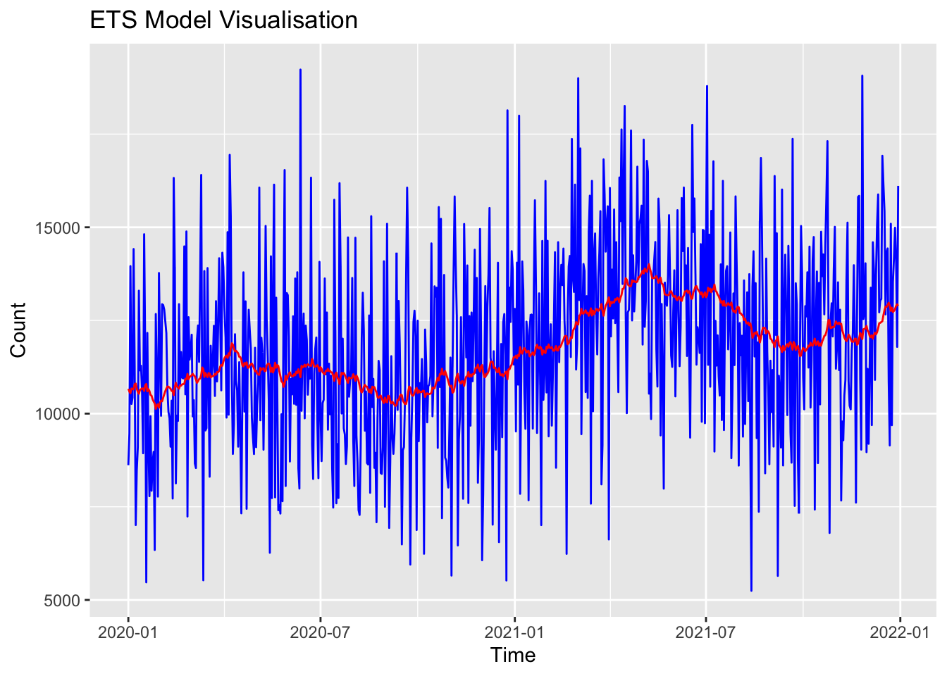
Now I have four different models that each attempts to predict future events based on historical time-series data; ar_model, ma_model, arima_model and ets_model.
I’d like to compare how these models ‘performed’ with my data, so I know which one I can rely on in the future.
The first approach we can use is criterion-based, where we use numerical information to compare models.
We noted previously that the most common metrics are AIC and BIC, so I’ll use them to evaluate how ‘good’ my models are:
checkresiduals(ar_model) # visual inspection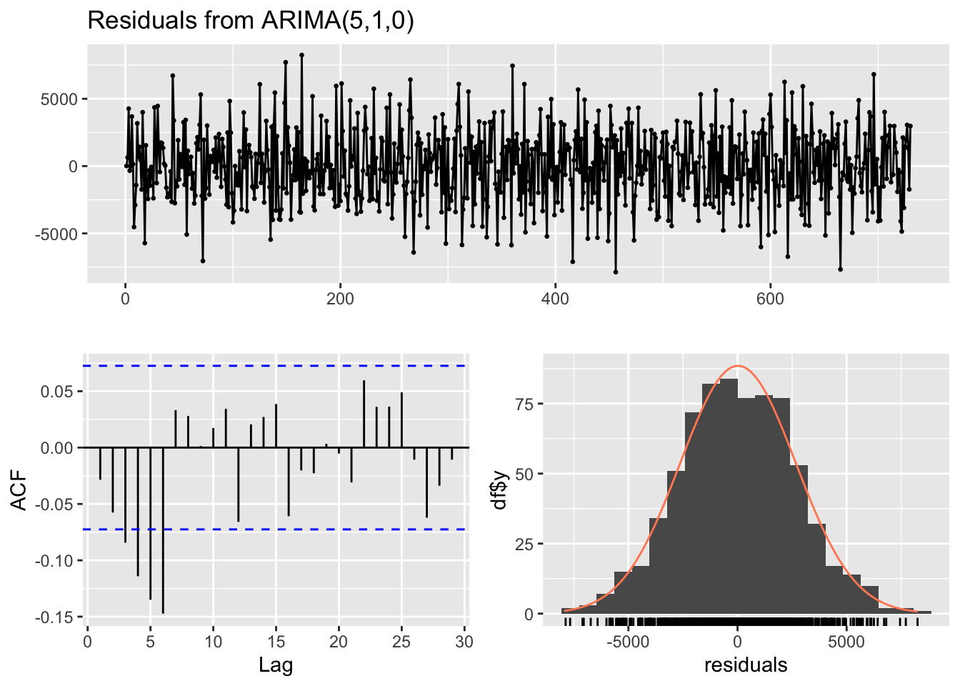
    Ljung-Box test

data:  Residuals from ARIMA(5,1,0)
Q* = 48.914, df = 5, p-value = 2.311e-09

Model df: 5. Total lags used: 10checkresiduals(ma_model) # visual inspection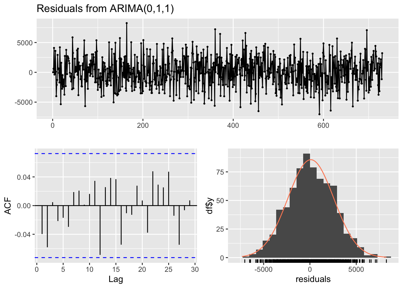
    Ljung-Box test

data:  Residuals from ARIMA(0,1,1)
Q* = 5.6318, df = 9, p-value = 0.7761

Model df: 1. Total lags used: 10checkresiduals(arima_model) # visual inspection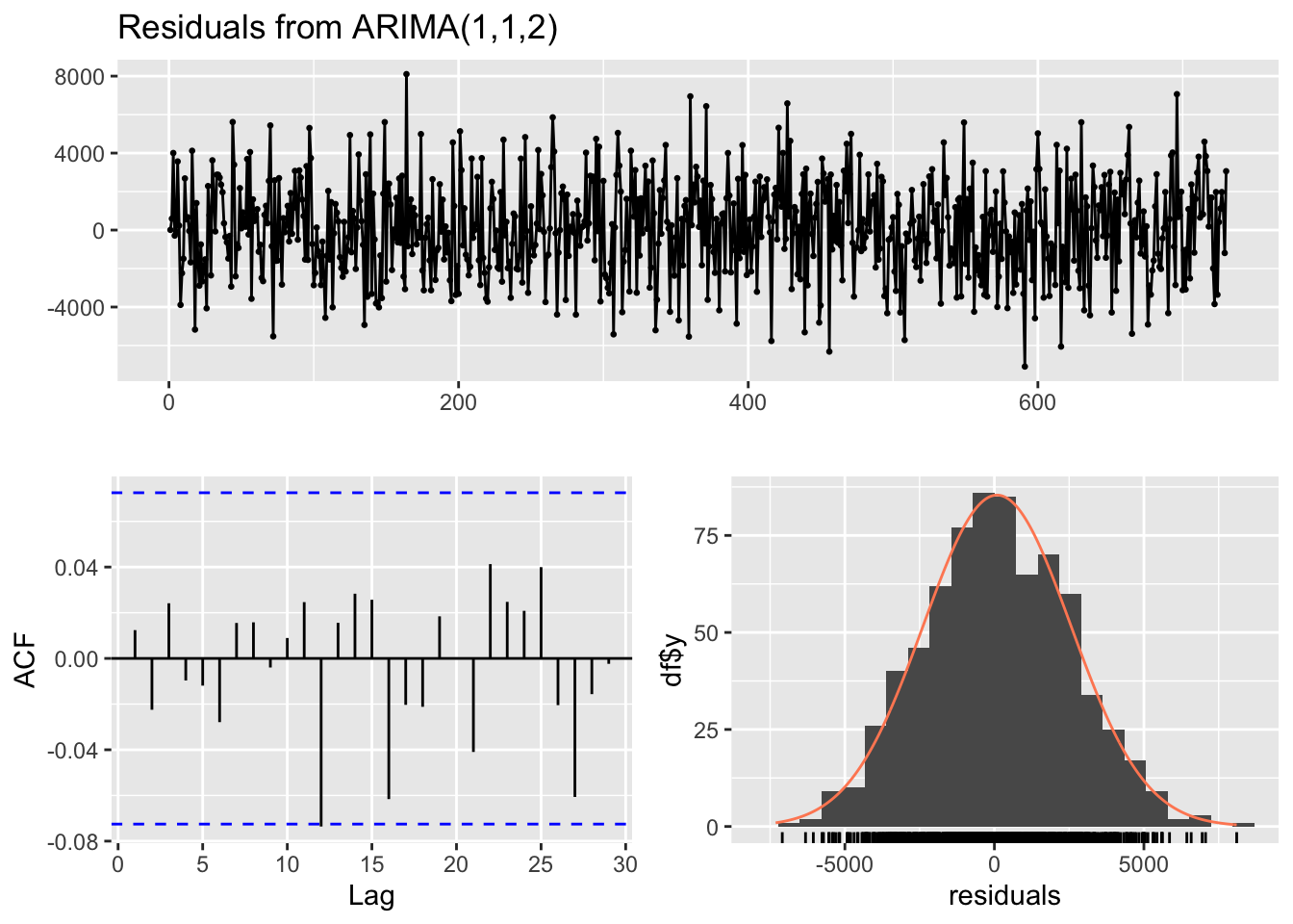
    Ljung-Box test

data:  Residuals from ARIMA(1,1,2)
Q* = 2.0936, df = 7, p-value = 0.9545

Model df: 3. Total lags used: 10checkresiduals(ets_model) # visual inspection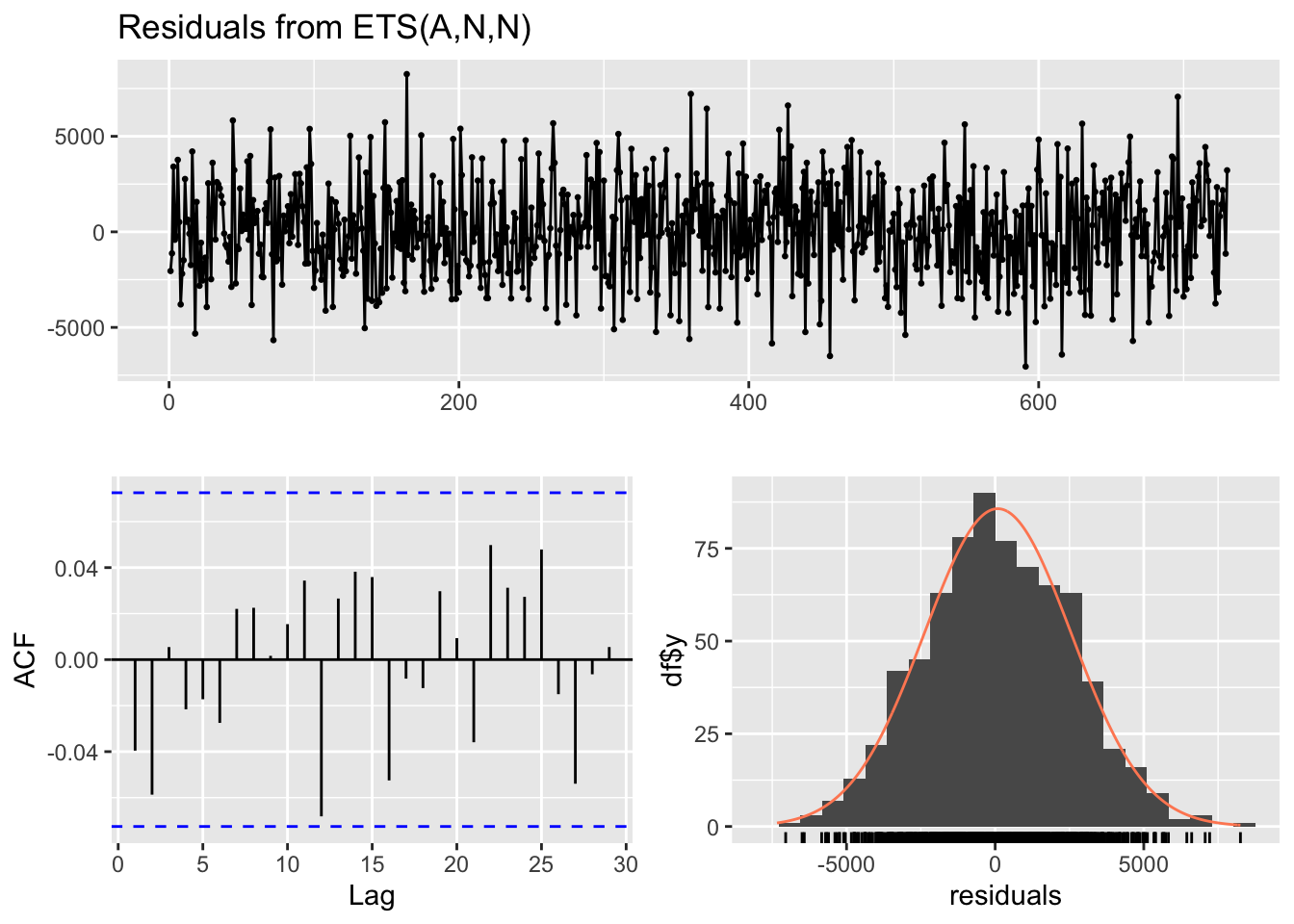
    Ljung-Box test

data:  Residuals from ETS(A,N,N)
Q* = 5.7332, df = 10, p-value = 0.8372

Model df: 0. Total lags used: 10print(arima_model$aic)[1] 13469.01print(arima_model$bic)[1] 13487.38print(ar_model$aic)[1] 13576.36print(ar_model$bic)[1] 13603.91# note that the AIC and BIC from the ARIMA model are lower than the AR model. This suggests that the ARIMA model is better.
print(ets_model$aic)[1] 16227.87print(ets_model$bic)[1] 16241.65print(ma_model$aic)[1] 13469.75print(ma_model$bic)[1] 13478.93# again, note that the ARIMA continues to out-perform the other models.This analysis indicates that the ARIMA model and the MA model are ‘better’ than the others. All things considered, I would probably stick with the ARIMA model, and use that as the basis for my subsequent analysis. This is because it performed better on the AIC, which is a less stringent test and less likely to ‘fail’.
Alongside criterion-based methods, we can also use residual diagnostics to compare the effectiveness of different models.
In the previous section I mentioned using the Ljung-Box Q-test. We can use the following to produce this for each of our models.
# Assuming you have your four models: model1, model2, model3, model4

# Extract residuals from each model
residuals1 <- residuals(ar_model)
residuals2 <- residuals(arima_model)
residuals3 <- residuals(ets_model)
residuals4 <- residuals(ma_model)

# Apply the Ljung-Box test
ljung_box_result_ar <- Box.test(residuals1, type = "Ljung-Box")
ljung_box_result_arima <- Box.test(residuals2, type = "Ljung-Box")
ljung_box_result_ets <- Box.test(residuals3, type = "Ljung-Box")
ljung_box_result_ma <- Box.test(residuals4, type = "Ljung-Box")

# Print the results
print(ljung_box_result_ar)
    Box-Ljung test

data:  residuals1
X-squared = 0.59288, df = 1, p-value = 0.4413print(ljung_box_result_arima)
    Box-Ljung test

data:  residuals2
X-squared = 0.11249, df = 1, p-value = 0.7373print(ljung_box_result_ets)
    Box-Ljung test

data:  residuals3
X-squared = 1.1474, df = 1, p-value = 0.2841print(ljung_box_result_ma)
    Box-Ljung test

data:  residuals4
X-squared = 1.1528, df = 1, p-value = 0.283
The function returns a test statistic and a p-value.
A high p-value (typically above 0.05) suggests that the residuals are independently distributed, which is a good indication that the model has adequately captured the information in the time series.n
Conversely, a low p-value might indicate that there is autocorrelation in the residuals, suggesting that the model may be missing some information from the data.
Note that the ARIMA output has the highest p-value, suggesting the residuals are independently distributed, and it is the ‘best’ type of model to use on this data. It confirms our analysis this model best accounts for the ‘time series’ nature of our data.
Remember: homoscedasticity implies that the residuals have constant variance across time. Heteroscedasticity, the opposite, suggests that the model’s error terms vary at different times, indicating that the model may not be equally effective across the entire dataset.
To check this in R we can carry out a number of different visual and statistical tests:
# Load packages
library(forecast)
library(tseries)
library(lmtest)
library(MASS)
library(FinTS)
Attaching package: 'FinTS'The following object is masked from 'package:forecast':
Acf# Step 1: Visual Inspection of Residuals
residuals_arima <- residuals(arima_model)
ts.plot(residuals_arima, main="Residuals over Time", ylab="Residuals")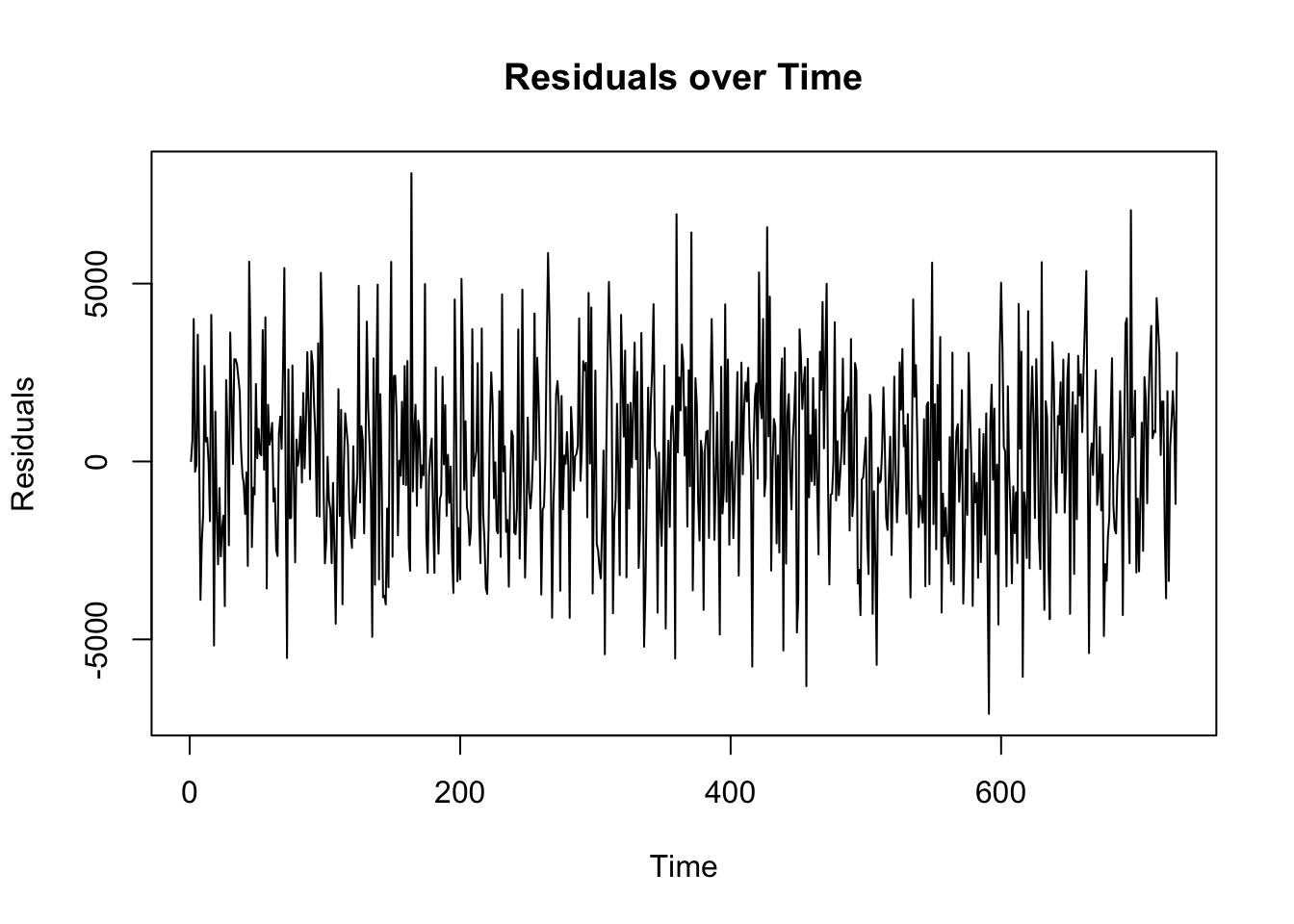
acf(residuals_arima, main="ACF of Residuals")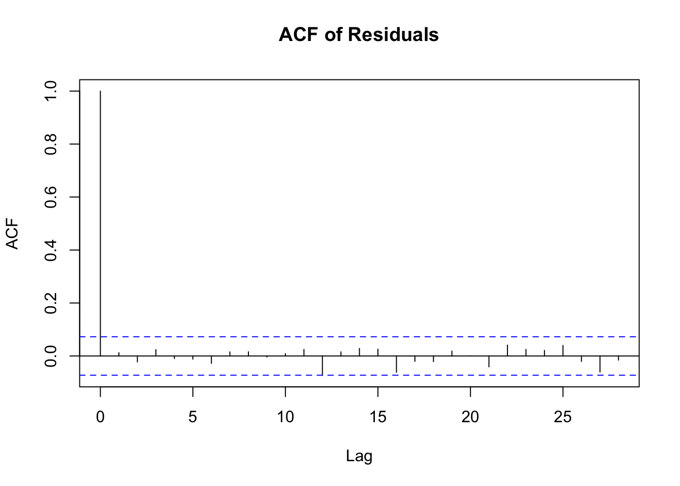
pacf(residuals_arima, main="PACF of Residuals")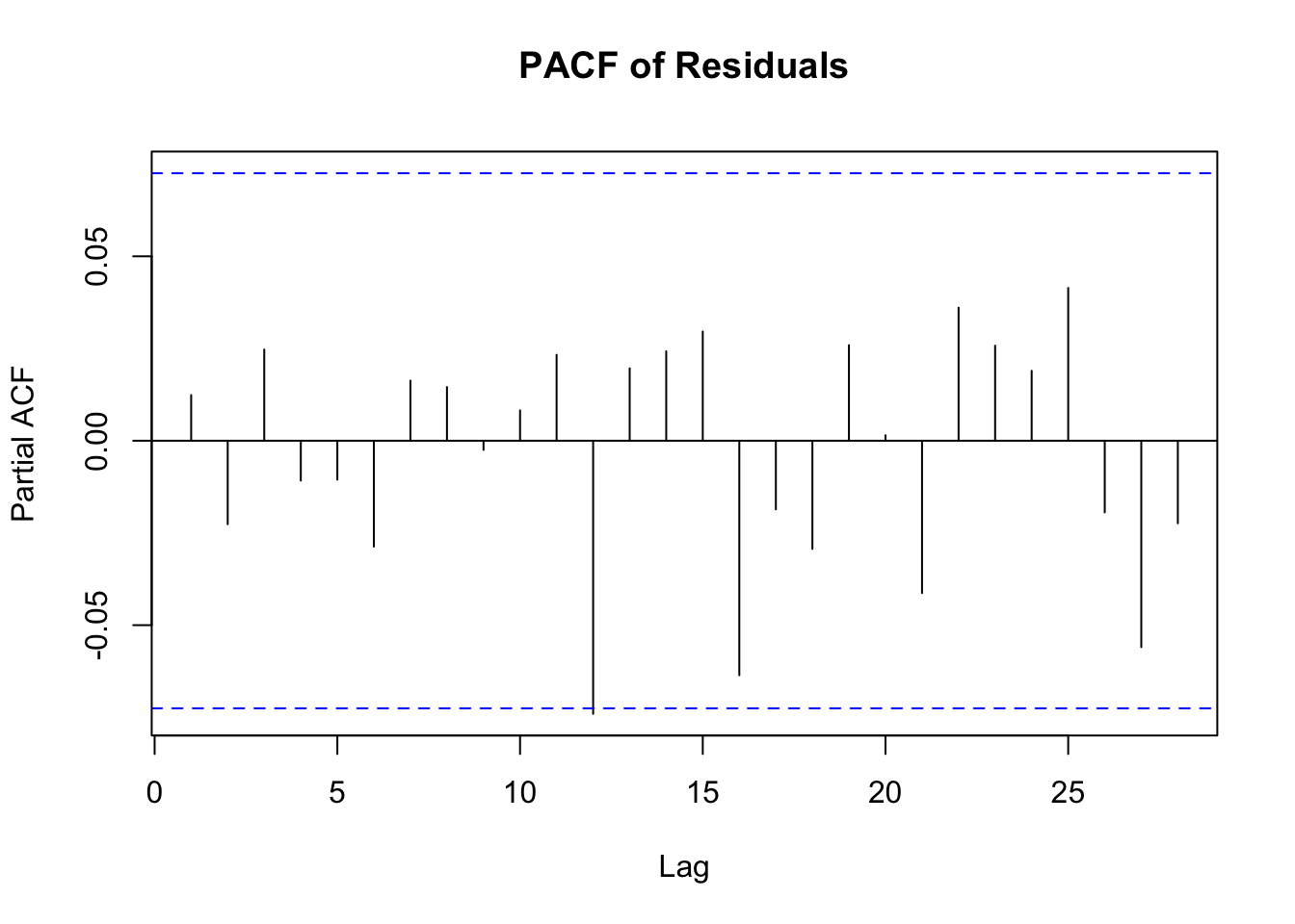
# Breusch-Pagan Test
bp_test <- bptest(residuals_arima ~ fitted(arima_model) + I(fitted(arima_model)^2))
print(bp_test)
    studentized Breusch-Pagan test

data:  residuals_arima ~ fitted(arima_model) + I(fitted(arima_model)^2)
BP = 3.0306, df = 2, p-value = 0.2197# Goldfeld-Quandt Test
gq_test <- gqtest(residuals_arima ~ fitted(arima_model))
print(gq_test)
    Goldfeld-Quandt test

data:  residuals_arima ~ fitted(arima_model)
GQ = 1.0259, df1 = 363, df2 = 363, p-value = 0.4039
alternative hypothesis: variance increases from segment 1 to 2
Let’s examine that output.
Breusch-Pagan Test Interpretation The Breusch-Pagan test is used to detect heteroscedasticity in a regression model.
Null Hypothesis (H0): The variance of the errors is constant (homoscedasticity).
Alternative Hypothesis (H1): The variance of the errors is not constant (heteroscedasticity).
p-value: The key output of this test is the p-value.
If the p-value is low (commonly below 0.05), you reject the null hypothesis, suggesting the presence of heteroscedasticity. If the p-value is high, you fail to reject the null hypothesis, indicating no evidence of heteroscedasticity.
Goldfeld-Quandt Test Interpretation
The Goldfeld-Quandt test is another test for heteroscedasticity.
Null Hypothesis (H0): The variances of the errors in two separate groups (usually split based on an independent variable) are equal (no heteroscedasticity).
Alternative Hypothesis (H1): The variances of the errors in the two groups are different (heteroscedasticity).
p-value: Similar to the Breusch-Pagan test, the interpretation is based on the p-value.
A low p-value (typically <0.05) suggests rejecting the null hypothesis, indicating heteroscedasticity. A high p-value suggests failing to reject the null hypothesis, indicating no evidence of heteroscedasticity.
PACF Plot Interpretation
The Partial Autocorrelation Function (PACF) plot is used primarily to identify the order of an autoregressive (AR) model. Here’s how to interpret it:
Spikes in the Plot: The PACF plot shows the partial correlation of a time series with its own lagged values, controlling for the values of the time series at all shorter lags. Significant spikes (extending beyond the blue dashed lines, which represent confidence intervals) indicate a correlation with the lagged value at that particular lag.
Determining AR Order: The number of significant spikes starting from the origin gives an indication of the order of the AR model. For instance, if the first two lags have significant spikes and the rest are insignificant, an AR(2) model might be appropriate.
Cut-off after a Certain Lag: A sharp cut-off after a certain lag while the rest of the lags are insignificant (close to zero) is a typical indication of an AR process.
ACF Plot Interpretation
Y-Axis (Correlation): The ACF plot shows the correlation of a time series with its own lagged values. The y-axis represents the correlation coefficient, ranging from -1 to 1.
X-Axis (Lags): The x-axis represents the number of lags. Each bar (or spike) in the plot represents the correlation at a specific lag.
Significant Correlation: The blue dashed lines in the plot represent confidence intervals (usually set at 95%). If a bar extends beyond these lines, it indicates a statistically significant correlation at that lag.
Interpreting Correlations:
Positive Correlation: If the bar is above the zero line, it indicates a positive correlation.
Negative Correlation: If the bar is below the zero line, it indicates a negative correlation. Determining Model Type:
Slow Decay: If the ACF shows a slow decay, it suggests a non-stationary series that might need differencing.
Sharp Drop after Lag k: If the ACF drops sharply after a certain lag k and then becomes insignificant, it may suggest an MA(k) model (Moving Average model of order k).
Seasonal Patterns: Repeated spikes at regular intervals suggest seasonality in the data.
Randomness: If all or most of the bars are within the confidence interval (not significantly different from zero), it suggests that the series is essentially random (white noise).
Finally, as you know, the assumption of normality in residuals is central to many statistical inference techniques.
If the residuals are normally distributed, it suggests that the model has successfully captured the underlying data distribution, and the error term is purely random.
We can use a Q-Q plot to test this for each model, as follows. In the Q-Q plot, we can say the residuals are normally distributed if they sit close to the red line.
# Extract residuals
residuals_arima <- residuals(arima_model)

# Q-Q plot
qqnorm(residuals_arima)
qqline(residuals_arima, col = "red")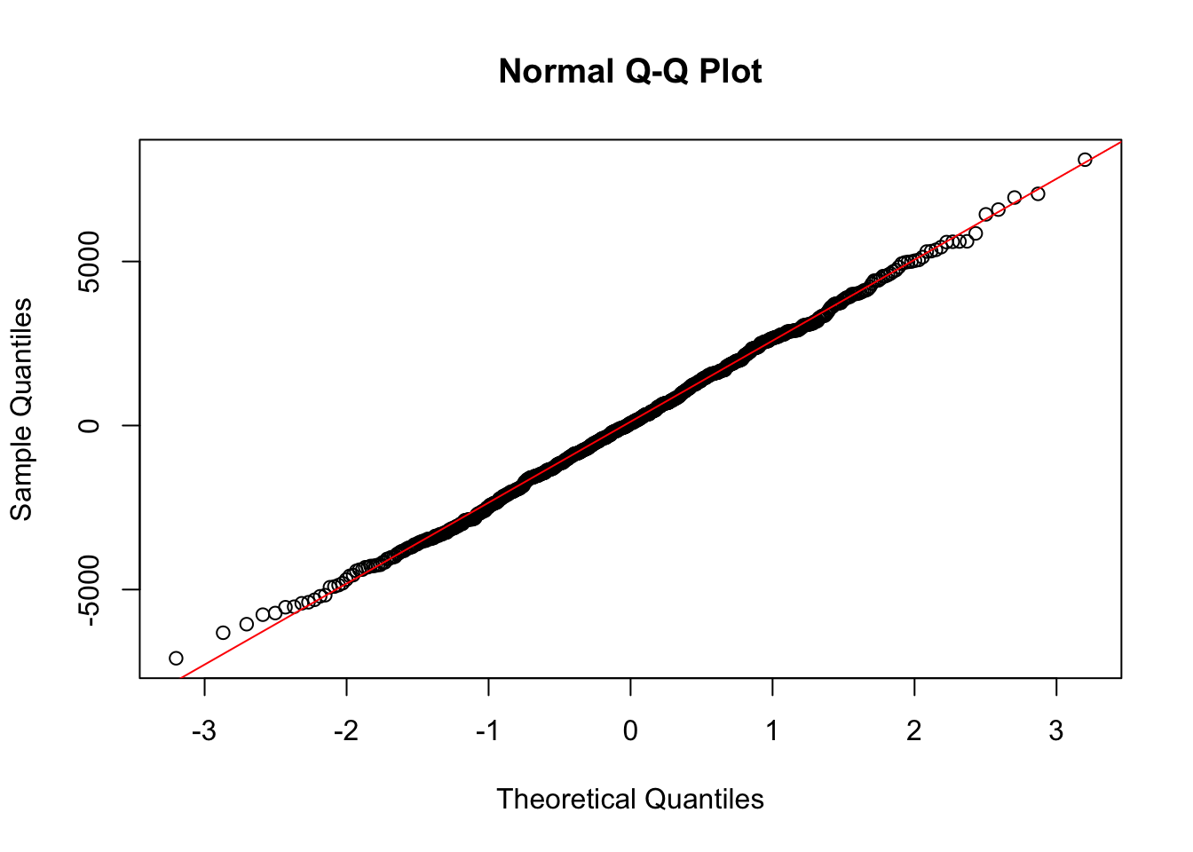
We can also carry out a Shapiro-Wilk test:
# Shapiro-Wilk normality test
shapiro_test <- shapiro.test(residuals_arima)
print(shapiro_test)
    Shapiro-Wilk normality test

data:  residuals_arima
W = 0.99862, p-value = 0.8522
Look at the p-value in the test output. - If the p-value is less than 0.05 (typical significance level), you reject the null hypothesis, an can assume that the residuals are not normally distributed. - If the p-value is greater than 0.05, you fail to reject the null hypothesis, and can assume that the residuals are normally distributed.
This was covered in the previous reading, but worth revising again as these are likely to be the types of models you will create most frequently.
ARIMA models (AutoRegressive Integrated Moving Average models) are frequently-used models in time-series analysis, especially for forecasting future trends based on past data. They help us predict future values in a sequence of data by analysing past values.
The “AR” part stands for AutoRegressive. The model looks at previous data points and uses these to predict future ones. It’s like trying to guess the next number in a sequence by looking at the numbers before it.
The “I” in ARIMA stands for Integrated. These models make the data more consistent and stable over time, often by removing trends or seasonal effects.
Lastly, the “MA” part stands for Moving Average. The models smooth out short-term fluctuations and highlight longer-term trends or cycles.
The SARIMA model is an extension of the ARIMA model, designed to better handle seasonal variations in time series data.
It’s structured to include both non-seasonal and seasonal elements. The full notation for a SARIMA model is SARIMA(p, d, q)(P, D, Q)m. Here’s what each of these components represents:
Non-Seasonal Components:
p (AutoRegressive Order): the number of lagged observations in the model. For instance, p = 2 would use the first two lagged values (like using data from the previous two months to predict this month’s value).
d (Integrated Order): the number of times the data needs to be differenced to make it stationary, meaning to stabilise the mean over time. For instance, if the data shows a linear trend, you might need to difference it once (d = 1) to remove that trend.
q (Moving Average Order): the size of the moving average window. It uses the error terms from the past forecasted values to improve the model’s accuracy.
Seasonal Components:
P (Seasonal AutoRegressive Order): similar to ‘p’, but for the seasonal part of the model. It represents the number of seasonal lags of the dependent variable that the model will use.
D (Seasonal Integrated Order): the number of seasonal differences required to make the series stationary.
Q (Seasonal Moving Average Order): similar to ‘q’, but for the seasonal part of the model. It represents the order of the moving average for the seasonal differences.
m (Seasonality Period): the number of time steps for a single seasonal period. For example, m = 12 for monthly data with an annual cycle.
The strength of SARIMA models is their ability to decompose a series into seasonal and non-seasonal components and analyse these elements separately yet simultaneously, giving us a more accurate forecast in seasonally affected time-series data than ARIMA.
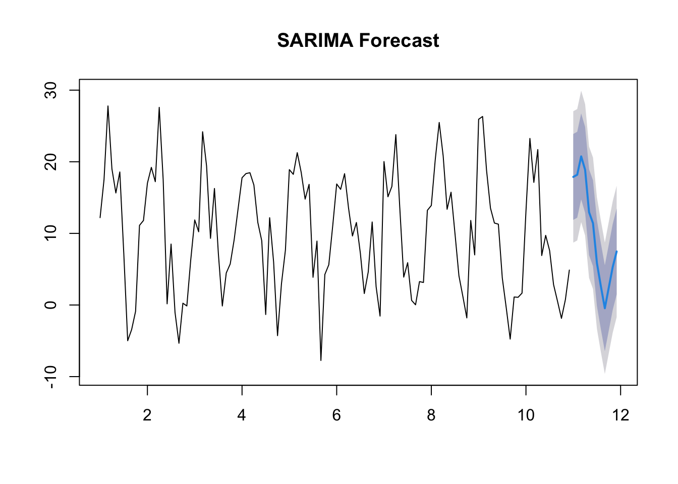
In this example, I’ve created a dataset with a strong seasonal element.
Note that the output of ARIMA, which ignores the seasonal element, is less useful in terms of future forecasting than SARIMA, which takes the seasonal element into account.
The AIC for the SARIMA model is lower than that for the ARIMA model, indicating it is more effective.
# Load libraries
library(forecast)

# Create Dataset
set.seed(123)
seasonal_component <- sin(seq(1, 120, length.out = 120) * 2 * pi / 12) * 10
time_series_data <- ts(rnorm(120, mean = 10, sd = 5) + seasonal_component, frequency = 12)

# Plot dataset

plot(time_series_data, main = "Time-Series with Strong Seasonality", xlab = "Month", ylab = "Value")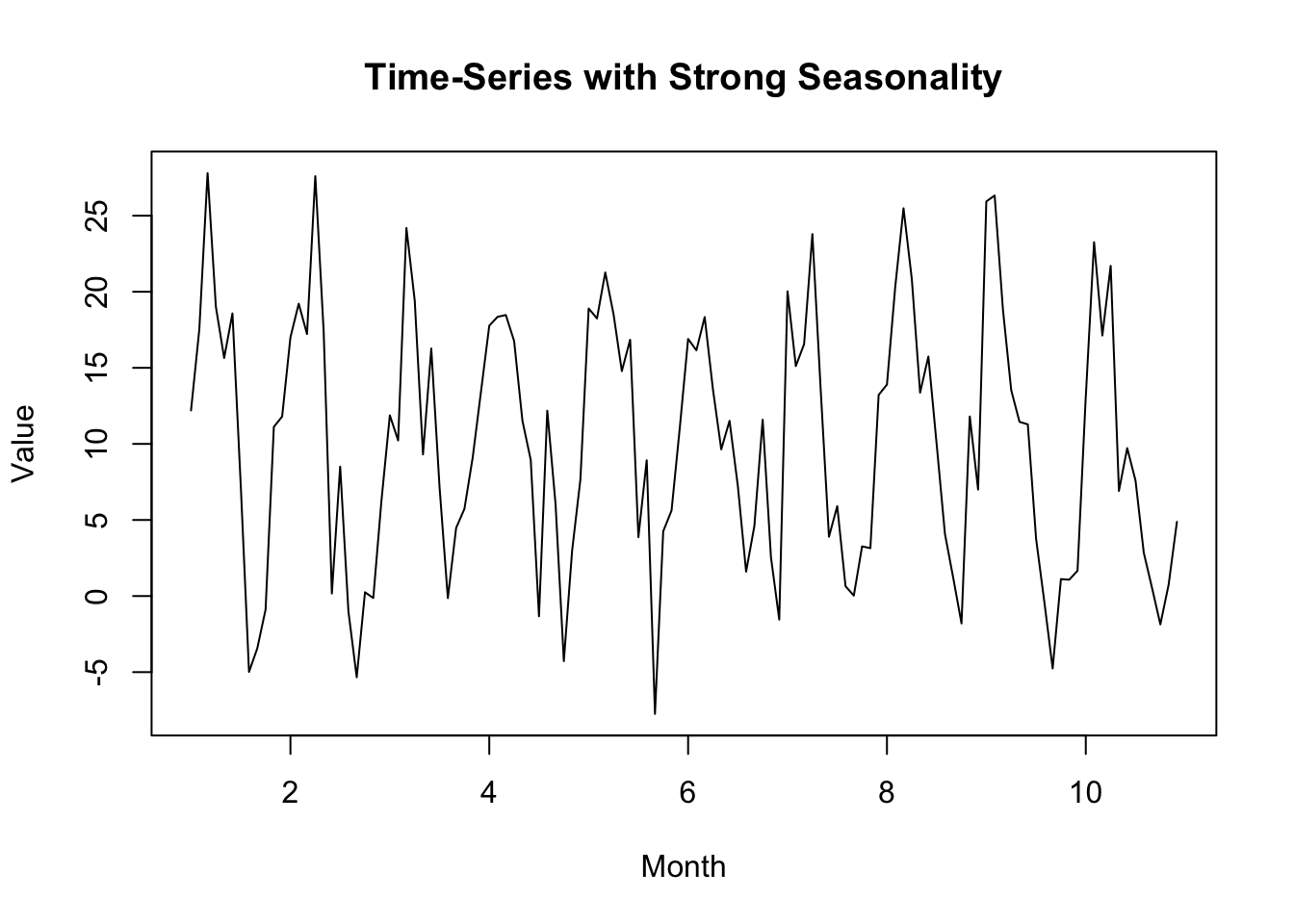
# ARIMA Model

arima_model <- auto.arima(time_series_data, seasonal = FALSE)
summary(arima_model)
Series: time_series_data
ARIMA(1,0,0) with non-zero mean
Coefficients:
ar1 mean
0.6204 10.0366
s.e. 0.0707 1.5384
sigma^2 = 42.74: log likelihood = -394.82
AIC=795.64 AICc=795.85 BIC=804.01
Training set error measures:
ME RMSE MAE MPE MAPE MASE
Training set -0.01512718 6.483211 5.120995 -99.28832 389.089 0.916242
ACF1
Training set 0.04754608forecast_arima <- forecast(arima_model, h = 12)
plot(forecast_arima, main = "ARIMA Forecast")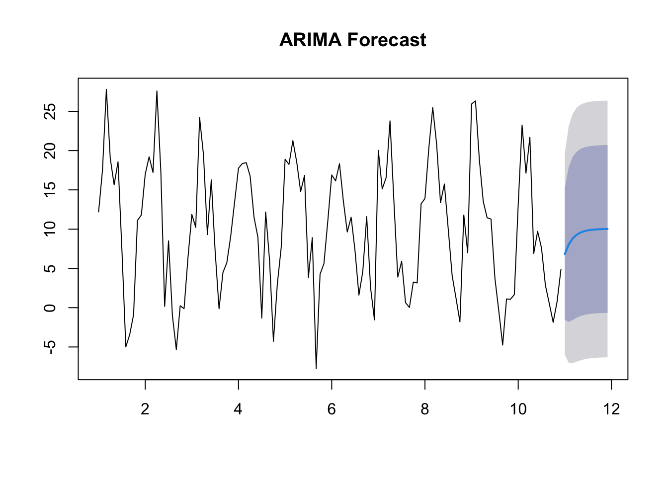
# SARIMA Model

sarima_model <- auto.arima(time_series_data, seasonal = TRUE)
summary(sarima_model)
Series: time_series_data
ARIMA(0,0,0)(0,1,2)[12]
Coefficients:
sma1 sma2
-1.0450 0.1803
s.e. 0.1533 0.1146
sigma^2 = 21.71: log likelihood = -327.85
AIC=661.7 AICc=661.94 BIC=669.75
Training set error measures:
ME RMSE MAE MPE MAPE MASE ACF1
Training set -0.2040055 4.379059 3.28606 3.637575 226.066 0.5879376 0.04117254forecast_sarima <- forecast(sarima_model, h = 12)
plot(forecast_sarima, main = "SARIMA Forecast")